【2.5.4】条形图(matplotlib-bar)
一、案例
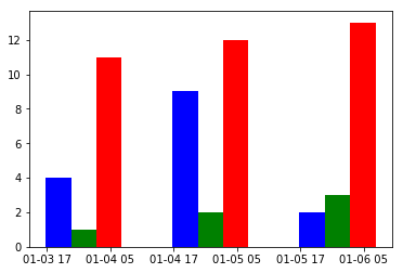
1.1 并排放
import matplotlib.pyplot as plt
from matplotlib.dates import date2num
import datetime

x = [datetime.datetime(2011, 1, 4, 0, 0),
     datetime.datetime(2011, 1, 5, 0, 0),
     datetime.datetime(2011, 1, 6, 0, 0)]
x = date2num(x)

y = [4, 9, 2]
z=[1,2,3]
k=[11,12,13]

ax = plt.subplot(111)
ax.bar(x-0.2, y,width=0.2,color='b',align='center')
ax.bar(x, z,width=0.2,color='g',align='center')
ax.bar(x+0.2, k,width=0.2,color='r',align='center')
ax.xaxis_date()

plt.show()
1.2 水平条形图

代码:
import matplotlib.pyplot as plt
import numpy as np

# Fixing random state for reproducibility
np.random.seed(19680801)


plt.rcdefaults()
fig, ax = plt.subplots()

# Example data
people = ('Tom', 'Dick', 'Harry', 'Slim', 'Jim')
y_pos = np.arange(len(people))
performance = 3 + 10 * np.random.rand(len(people))
error = np.random.rand(len(people))

ax.barh(y_pos, performance, xerr=error, align='center',
        color='green', ecolor='black')
ax.set_yticks(y_pos)
ax.set_yticklabels(people)
ax.invert_yaxis()  # labels read top-to-bottom
ax.set_xlabel('Performance')
ax.set_title('How fast do you want to go today?')

plt.show()
1.3 显示数据
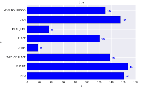
import os
import numpy as np
import matplotlib.pyplot as plt

x = [u'INFO', u'CUISINE', u'TYPE_OF_PLACE', u'DRINK', u'PLACE', u'MEAL_TIME', u'DISH', u'NEIGHBOURHOOD']
y = [160, 167, 137, 18, 120, 36, 155, 130]

fig, ax = plt.subplots()
width = 0.75 # the width of the bars
ind = np.arange(len(y))  # the x locations for the groups
ax.barh(ind, y, width, color="blue")
ax.set_yticks(ind+width/2)
ax.set_yticklabels(x, minor=False)
plt.title('title')
plt.xlabel('x')
plt.ylabel('y')

#添加标签
for i, v in enumerate(y):
	ax.text(v + 3, i + .25, str(v), color='blue', fontweight='bold')

#plt.show()
plt.savefig(os.path.join('test.png'), dpi=300, format='png', bbox_inches='tight') # use format='svg' or 'pdf' for vectorial pictures
1.4 加颜色
条形图是根据计数或任何给定指标可视化项目的经典方式。 在下面的图表中,我为每个项目使用了不同的颜色,但您通常可能希望为所有项目选择一种颜色,除非您按组对它们进行着色。 颜色名称存储在下面代码中的all_colors中。 您可以通过在plt.plot()中设置颜色参数来更改条形的颜色。

import random

# Import Data
df_raw = pd.read_csv("https://github.com/selva86/datasets/raw/master/mpg_ggplot2.csv")

# Prepare Data
df = df_raw.groupby('manufacturer').size().reset_index(name='counts')
n = df['manufacturer'].unique().__len__()+1
all_colors = list(plt.cm.colors.cnames.keys())
random.seed(100)
c = random.choices(all_colors, k=n)

# Plot Bars
plt.figure(figsize=(16,10), dpi= 80)
plt.bar(df['manufacturer'], df['counts'], color=c, width=.5)
for i, val in enumerate(df['counts'].values):
    plt.text(i, val, float(val), horizontalalignment='center', verticalalignment='bottom', fontdict={'fontweight':500, 'size':12})

# Decoration
plt.gca().set_xticklabels(df['manufacturer'], rotation=60, horizontalalignment= 'right')
plt.title("Number of Vehicles by Manaufacturers", fontsize=22)
plt.ylabel('# Vehicles')
plt.ylim(0, 45)
plt.show()
1.5 官方高级例子

数据集
# sphinx_gallery_thumbnail_number = 10
import numpy as np
import matplotlib.pyplot as plt
from matplotlib.ticker import FuncFormatter

data = {'Barton LLC': 109438.50,
        'Frami, Hills and Schmidt': 103569.59,
        'Fritsch, Russel and Anderson': 112214.71,
        'Jerde-Hilpert': 112591.43,
        'Keeling LLC': 100934.30,
        'Koepp Ltd': 103660.54,
        'Kulas Inc': 137351.96,
        'Trantow-Barrows': 123381.38,
        'White-Trantow': 135841.99,
        'Will LLC': 104437.60}
group_data = list(data.values())
group_names = list(data.keys())
group_mean = np.mean(group_data)
自定义函数
def currency(x, pos):
    """The two args are the value and tick position"""
    if x >= 1e6:
        s = '${:1.1f}M'.format(x*1e-6)
    else:
        s = '${:1.0f}K'.format(x*1e-3)
    return s

formatter = FuncFormatter(currency)
定义风格
#查看风格
print(plt.style.available)

['seaborn-ticks', 'ggplot', 'dark_background', 'bmh', 'seaborn-poster', 'seaborn-notebook', 'fast', 'seaborn', 'classic', 'Solarize_Light2', 'seaborn-dark', 'seaborn-pastel', 'seaborn-muted', '_classic_test', 'seaborn-paper', 'seaborn-colorblind', 'seaborn-bright', 'seaborn-talk', 'seaborn-dark-palette', 'tableau-colorblind10', 'seaborn-darkgrid', 'seaborn-whitegrid', 'fivethirtyeight', 'grayscale', 'seaborn-white', 'seaborn-deep']

#使用风格
plt.style.use('fivethirtyeight')


fig, ax = plt.subplots(figsize=(8, 8)) #图片大小
ax.barh(group_names, group_data)
labels = ax.get_xticklabels()
plt.setp(labels, rotation=45, horizontalalignment='right')

# Add a vertical line, here we set the style in the function call
ax.axvline(group_mean, ls='--', color='r')

# Annotate new companies
for group in [3, 5, 8]:
    ax.text(145000, group, "New Company", fontsize=10,
            verticalalignment="center")

# Now we'll move our title up since it's getting a little cramped
ax.title.set(y=1.05)

ax.set(xlim=[-10000, 140000], xlabel='Total Revenue', ylabel='Company',
       title='Company Revenue')
ax.xaxis.set_major_formatter(formatter)
ax.set_xticks([0, 25e3, 50e3, 75e3, 100e3, 125e3])
fig.subplots_adjust(right=.1)

plt.show()
1.5 分组

import pandas as pd
import matplotlib.pyplot as plt

# Define Data

data=[["Team A", 500, 100, 350, 250, 400, 600],
      ["Team B", 130, 536, 402, 500, 350, 250],
      ["Team C", 230, 330, 500, 450, 600, 298],
      ["Team D", 150, 398, 468, 444, 897, 300]
     ]

# Plot multiple groups

df=pd.DataFrame(data,columns=["Team","January", "March", "May", "July", "September", "November"])

df.plot(x="Team", y=["January", "March", "May", "July", "September", "November"], kind="bar",
 figsize=(8,4))

# Show

plt.show()
1.6 发专列的非彩色图

When you add edgecolor = "k", code is as follows,

import matplotlib.pyplot as plt

# Input data; groupwise
green_data = [16, 23, 22, 21, 13, 11, 18, 15]
blue_data =  [ 3,  3,  0,  0,  5,  5,  3,  3]
red_data =   [ 6,  6,  6,  0,  0,  0,  0,  0]
black_data = [25, 32, 28, 21, 18, 16, 21, 18]

labels = ['XI', 'XII', 'XIII', 'XIV', 'XV', 'XVI', 'XVII', 'XVIII']

# Setting the positions and width for the bars
pos = list(range(len(green_data)))
width = 0.15 # the width of a bar

# Plotting the bars
fig, ax = plt.subplots(figsize=(10,6))

bar1=plt.bar(pos, green_data, width,
             alpha=0.5,
             color='w',
             hatch='x', # this one defines the fill pattern
             label=labels[0],edgecolor='black')

plt.bar([p + width for p in pos], blue_data, width,
             alpha=0.5,
             color='w',
             hatch='o',
             label=labels[1],edgecolor='black')

plt.bar([p + width*2 for p in pos], red_data, width,
             alpha=0.5,
             color='k',
             hatch='',
             label=labels[2],edgecolor='black')

plt.bar([p + width*3 for p in pos], black_data, width,
             alpha=0.5,
             color='w',hatch='*',
             label=labels[3],edgecolor='black')


# Setting axis labels and ticks
ax.set_ylabel('Number of Switching')
ax.set_xlabel('Strategy')
ax.set_title('Grouped bar plot')
ax.set_xticks([p + 1.5 * width for p in pos])
ax.set_xticklabels(labels)

# Setting the x-axis and y-axis limits
plt.xlim(min(pos)-width, max(pos)+width*5)
plt.ylim([0, max(green_data + blue_data + red_data) * 1.5])

# Adding the legend and showing the plot
plt.legend(['OLTC', 'SVC', 'SC', 'OLTC+SC+SVC'], loc='upper right')
plt.grid()
plt.show()
三、我的案例

代码:
import matplotlib.pyplot as plt
import numpy as np
import pandas as pd
from matplotlib.dates import date2num
import datetime
import matplotlib.patches as mpatches

aa = pd.read_csv("absim_data_loc_mutated_freq.tsv",sep='\t',index_col=False)
# a2 = a1[25:35]
# a3 = a1[49:66]
# aa = pd.concat([a2,a3])

bb = pd.read_csv("ig_loc_mutated_freq.tsv",sep='\t',index_col=False)
# b2 = b1[25:35]
# b3 = b1[49:66]
# bb = pd.concat([b2,b3])

x = np.array(aa['#AA_Loc'])

# ax = plt.subplot(111)
f,(ax,ax2) = plt.subplots(1,2,sharey=True, facecolor='w')


aa_list = ['A', 'C', 'D', 'E', 'F', 'G', 'H', 'I', 'K', 'L', 'M', 'N', 'P', 'Q', 'R', 'S', 'T', 'V', 'W', 'Y']

NUM_COLORS = len(aa_list)
cm = plt.get_cmap('gist_rainbow')
bottom_start = 0
bottom_start2 = 0
color_patch = []


d = .015  # how big to make the diagonal lines in axes coordinates
# arguments to pass to plot, just so we don't keep repeating them

for ii in range(len(aa_list)):
    aa_base = aa_list[ii]

    one_color = cm(ii//3*3.0/NUM_COLORS)
    color_patch.append(mpatches.Patch(color=one_color, label=aa_base))

#   kwargs = dict(transform=ax.transAxes, clip_on=False)
    ax.bar(x-0.2, np.array(aa[aa_base]),width=0.2,color=one_color,bottom=bottom_start,align='center')
    ax2.bar(x-0.2, np.array(aa[aa_base]),width=0.2,color=one_color,bottom=bottom_start,align='center')

    bottom_start += np.array(aa[aa_base])


    ax.bar(x, np.array(bb[aa_base]),width=0.2,color=one_color,bottom=bottom_start2,align='center')
    ax2.bar(x, np.array(bb[aa_base]),width=0.2,color=one_color,bottom=bottom_start2,align='center')

    bottom_start2 += np.array(bb[aa_base])


# ax.bar(x+0.2, k,width=0.2,color='r',align='center')


ax.set_xlim(24, 37)  # outliers only
ax2.set_xlim(47, 68)  # most of the data

# hide the spines between ax and ax2
ax.spines['right'].set_visible(False)
ax2.spines['left'].set_visible(False)
ax.yaxis.tick_left()
ax.tick_params(labelright='off')
ax2.yaxis.tick_right()

# plt.axis([25,16,37,18],['a','b','c','d'])

d = .015 # how big to make the diagonal lines in axes coordinates
# arguments to pass plot, just so we don't keep repeating them
kwargs = dict(transform=ax.transAxes, color='k', clip_on=False)
ax.plot((1-d,1+d), (-d,+d), **kwargs)
ax.plot((1-d,1+d),(1-d,1+d), **kwargs)

kwargs.update(transform=ax2.transAxes)  # switch to the bottom axes
ax2.plot((-d,+d), (1-d,1+d), **kwargs)
ax2.plot((-d,+d), (-d,+d), **kwargs)


plt.legend(bbox_to_anchor=(1.02, 1), loc=2, borderaxespad=0.,handles=color_patch, prop={'size': 7})
# prop={'size': 7}调整legend大小

plt.text(1.8, 0.9, 'AbSim | IgSimulator', horizontalalignment='center',verticalalignment='center', transform=ax.transAxes)
plt.xlabel('AA Location of Sequence')
ax.xaxis.set_label_coords(-0.2, -0.1)  # 调整x轴label的位置
ax2.xaxis.set_label_coords(-0.2, -0.1)

plt.ylabel('AA bases Percent (%)')
ax.yaxis.set_label_coords(-1.4, 0.5) # 调整y轴label的位置
ax2.yaxis.set_label_coords(-1.4, 0.5)

plt.title('SHM Mutation Distribution',x=-0.1) #调整title的x轴的位置

# plt.xticks(np.arange(x.min(), x.max(), 1))


#plt.savefig('shm_mutated_distibution.jpeg',dpi=400) #保存图片
plt.show()
注:
bottom 相当于定位bar的起始位置,不断的往上加
案例2

代码
import matplotlib.pyplot as plt
import numpy as np
import pandas as pd
from matplotlib.dates import date2num
import datetime
import matplotlib.patches as mpatches

aa = pd.read_csv("ig_loc_mutated_nucl_freq.tsv",sep='\t',index_col=False)
bb = pd.read_csv("ig_bases_mutated_nucl_freq.tsv",sep='\t',index_col=False,header=None,skip_blank_lines=True)

aa2 = pd.read_csv("absim_data_loc_mutated_nucl_freq.tsv",sep='\t',index_col=False)
bb2 = pd.read_csv("absim_data_bases_mutated_nucl_freq.tsv",sep='\t',index_col=False,header=None,skip_blank_lines=True)

aa3 = pd.read_csv("shazam_loc_mutated_freq_nucl.tsv",sep='\t',index_col=False)
bb3 = pd.read_csv("shazam_bases_mutated_freq_nucl.tsv",sep='\t',index_col=False,header=None,skip_blank_lines=True)


# plt.rc('axes', labelsize=5)
plt.rc('xtick', labelsize=6)
plt.rc('ytick', labelsize=6)

fig = plt.figure()

# ax = fig.add_subplot(111)    # The big subplot
ax1 = fig.add_subplot(3,2,1)
ax2 = fig.add_subplot(3,2,2)
ax3 = fig.add_subplot(3,2,3)
ax4 = fig.add_subplot(3,2,4)
ax5 = fig.add_subplot(3,2,5)
ax6 = fig.add_subplot(3,2,6)

aa_list = ['A', 'T','C','G']

NUM_COLORS = len(aa_list)
cm = ['y','b','r','g']

bottom_start = 0
bottom_start2 = 0
bottom_start3 = 0
color_patch = []

for ii in range(len(aa_list)):
    aa_base = aa_list[ii]

    one_color = cm[ii]
    color_patch.append(mpatches.Patch(color=one_color, label=aa_base))
    ax2.bar(np.array(aa['#AA_Loc']), np.array(aa[aa_base]),color=one_color,bottom=bottom_start,align='center')
    bottom_start += np.array(aa[aa_base])

x1 =[76,76]
x2= [105,105]
x3= [148,148]
x4= [198,198]
y = [0,5]

# ax2.set_ylabel('')
# ax2.set_xlim(0, 287)
ax2.set_ylim(0, 5)
ax2.plot(x1, y, '--', picker=5,color='r')
ax2.plot(x2, y, '--', picker=5,color='r')
ax2.plot(x3, y, '--', picker=5,color='g')
ax2.plot(x4, y, '--', picker=5,color='g')
ax2.text(77, 4, 'CDR1', fontsize=6,color='r')
ax2.text(155, 4, 'CDR2', fontsize=6,color='g')

ax1.set_xlim(0, 20)
ax1.bar( np.array(bb[0]), np.array(bb[1]))
ax1.text(14, 17, 'IgSimulator\nNum:1000000', fontsize=6,color='r')


for ii in range(len(aa_list)):
    aa_base = aa_list[ii]
    one_color = cm[ii]
    ax4.bar(np.array(aa2['#AA_Loc']), np.array(aa2[aa_base]),color=one_color,bottom=bottom_start2,align='center')
    bottom_start2 += np.array(aa2[aa_base])

ax3.bar( np.array(bb2[0]), np.array(bb2[1]))
ax3.set_xlim(0, 60)
ax3.text(44, 4.2, 'AbSim_Data\nNum:100000', fontsize=6,color='r')

ax4.set_ylim(0, 75)
y2 = [0,75]
ax4.plot(x1, y2, '--', picker=5,color='r')
ax4.plot(x2, y2, '--', picker=5,color='r')
ax4.plot(x3, y2, '--', picker=5,color='g')
ax4.plot(x4, y2, '--', picker=5,color='g')

for ii in range(len(aa_list)):
    aa_base = aa_list[ii]
    one_color = cm[ii]
    ax6.bar(np.array(aa3['#AA_Loc']), np.array(aa3[aa_base]),color=one_color,bottom=bottom_start3,align='center')
    bottom_start3 += np.array(aa3[aa_base])

ax6.set_ylim(0, 7)
y3 = [0,7]
ax6.plot(x1, y3, '--', picker=5,color='r')
ax6.plot(x2, y3, '--', picker=5,color='r')
ax6.plot(x3, y3, '--', picker=5,color='g')
ax6.plot(x4, y3, '--', picker=5,color='g')


ax5.bar( np.array(bb[0]), np.array(bb[1]))
ax5.set_xlim(0, 20)
ax5.text(14, 17, 'ShaZam\nNum:9039753', fontsize=6,color='r')


title_font = {'fontname':'Arial', 'size':'10', 'color':'black', 'weight':'normal',
              'verticalalignment':'bottom'}
ax1.set_title('Histogram of Mutated Bases Frequency',**title_font)
ax2.set_title('Barplot of Base Mutated Frequency',**title_font)

ax3.set_ylabel('Frequency (%)',size=10)

ax5.set_xlabel('# Mutated Bases',size=10)
ax6.set_xlabel('Base Loc',size=10)

plt.legend(bbox_to_anchor=(0.02, 3.4), loc=2, borderaxespad=0.,handles=color_patch, prop={'size': 6})

plt.savefig('shm_mutated_distibution_1.jpeg',dpi=400)
# plt.show()
案例3

代码
import matplotlib

# matplotlib.use('Agg')
import matplotlib.pyplot as plt
from collections import Counter
import matplotlib.patches as mpatches

plt.rcdefaults()

list1 = []
list2 = []
list3 = []

input_file = 'result/adimab-ident-2.tsv'

with open(input_file) as data1:
    for each_line in data1:
        if each_line.strip() =='' or each_line.startswith('Query'):
            continue
        cnt = each_line.strip().split('\t')
        hit_name = cnt[1]
        list1.append(hit_name)
        list2.append(hit_name.split("*")[0])
        list3.append(hit_name.split("-")[0].split('/')[0].replace('D',''))

list1_count = Counter(list1)
list2_count = Counter(list2)
list3_count = Counter(list3)

ax = plt.subplot(111)

data_x = []
data_y = []
ticks_name = []
num = 0

data_x_1 = []
data_x_2 = []
data_x_3 = []
data_y_1 = []
data_y_2 = []
data_y_3 = []

sorted_list = sorted(list3_count.items(),key=lambda(k,v):k,reverse=True) # 用名字来排序
for one_key in sorted_list:
    num +=1
    data_x.append(num)
    data_y.append(one_key[1])
    ticks_name.append(one_key[0])
    if 'HV' in one_key[0]:
        data_x_1.append(num)
        data_y_1.append(one_key[1])
    elif 'KV' in one_key[0]:
        data_x_2.append(num)
        data_y_2.append(one_key[1])
    elif 'LV' in one_key[0]:
        data_x_3.append(num)
        data_y_3.append(one_key[1])

ax.barh(data_x_1, data_y_1,color='b',align='center')  # 横着的bar
ax.barh(data_x_2, data_y_2,color='r',align='center')
ax.barh(data_x_3, data_y_3,color='g',align='center')

ax.set_xlabel('# Num')
ax.set_ylabel('Gene name')

# 加legand
blue_patch = mpatches.Patch(color='blue', label='IGHV')
red_patch = mpatches.Patch(color='red', label='IGKV')
green_patch = mpatches.Patch(color='green', label='IGLV')

plt.legend(handles=[blue_patch,red_patch,green_patch])

# plt.xticks(rotation=90) # 选择xticks
ax.set_yticks(data_x)
ax.set_yticklabels(ticks_name)

fig = matplotlib.pyplot.gcf()
fig.set_size_inches(12, 9.5)
plt.savefig('pic/family-2.jpeg',dpi=400)
plt.show()
案例4

代码:
import matplotlib.pyplot as plt
import numpy as np
import pandas as pd
import matplotlib
from matplotlib.pyplot import subplots_adjust

input_tsv = 'result.tsv'
df = pd.read_csv(input_tsv,sep='\t')
columns = list(df.columns.values)
columns.remove('Residue')

new_colunm = ['Residue','Codon'] + columns
df_new = pd.DataFrame(columns=new_colunm)
index = 0

residue_hash = {}

for index_1,row_1 in df.iterrows():
    one_residue = row_1['Residue']
    if one_residue not in residue_hash :
        residue_hash[one_residue] = {}

    for one_column in columns:
        column_values = row_1[one_column]
        codon_values_list = column_values.split(';')
        for one_codon_value in codon_values_list:
            if one_codon_value == ' ':
                continue
            one_codon = one_codon_value.split('(')[0].strip()
            one_value = one_codon_value.split('(')[1].split(')')[0].strip()
            if one_codon not in residue_hash[one_residue]:
                residue_hash[one_residue][one_codon] = {}
            residue_hash[one_residue][one_codon][one_column] = one_value

for one_residue in residue_hash:
    for one_codon in residue_hash[one_residue]:
        one_line = [one_residue,one_codon ]
        values_list = []
        for one_column in columns:
            one_value = float(residue_hash[one_residue][one_codon][one_column])
            values_list.append(one_value)
        one_line = one_line + values_list
        df_new.loc[index] =one_line
        index +=1

# fig = plt.figure()
fig, axs = plt.subplots(2,1,figsize=(22,10))


def draw_one(df_new,ax_index=0):
    ax = axs[ax_index]
    labels = df_new['Codon']
    homo_values = df_new['homo spacies']
    genwiz = df_new['39_G']
    genscript = df_new['37_G']
    moderna = df_new['moa']


    residue_codon_hash = {}
    columns_new = list(df_new.columns.values)
    columns_new.remove('Codon')
    for index_1,row_1 in df_new.iterrows():
        one_residue = row_1['Residue']
        if one_residue not in residue_codon_hash :
            residue_codon_hash[one_residue] = {}
            residue_codon_hash[one_residue]['codon'] = []
            residue_codon_hash[one_residue]['max'] = 0
            residue_codon_hash[one_residue]['min'] = 100
        for one_column in columns_new:
            column_values = row_1[one_column]
            one_codon = row_1['Codon']
            residue_codon_hash[one_residue]['codon'].append(one_codon)

    x = np.arange(len(labels))  # the label locations
    width = 0.18  # the width of the bars

    rects1 = ax.bar(x - 2*width + width/2, homo_values, width, label='Homo spacies',color='black')
    rects2 = ax.bar(x - width + width/2, genwiz, width, label='39_Genwiz',color='orange')
    rects3 = ax.bar(x + width- width/2, genscript, width, label='37_Genscript',color='green')
    rects4 = ax.bar(x + width*2- width/2, moderna, width, label='Moderna',color='red')

    bar_pos = []
    bar_label = []

    for bar in ax.patches:
        bar_pos.append(bar.get_x())
        bar_label.append(bar.get_label())

    ax.set_xticks(x)
    ax.set_xticklabels(labels)
    ax.legend()

    bar_labels = ax.get_xticklabels()
    bar_locs = ax.get_xticks()

    for bar_loc,one_bar in zip(bar_locs,bar_labels):
        bar_loc = int(bar_loc)
        bar_codon = one_bar._text
        for one_residue in residue_codon_hash:
            if bar_codon in residue_codon_hash[one_residue]['codon']:
                residue_codon_hash[one_residue]['max'] = max(residue_codon_hash[one_residue]['max'],bar_loc)
                residue_codon_hash[one_residue]['min'] = min(residue_codon_hash[one_residue]['min'],bar_loc)

    trans = ax.get_xaxis_transform()

    for one_re in residue_codon_hash:
        x_start = residue_codon_hash[one_re]['min']
        x_end = residue_codon_hash[one_re]['max']
        xpos = (x_end + x_start)/2
        ax.annotate('', xy=(x_end+0.3, -0.23), xytext=(x_start-0.3, -0.23),xycoords=trans,arrowprops=dict(arrowstyle="<->", color='red'))
        ax.text(xpos,-0.3, one_re, size = 15, ha = 'center')


    ax.xaxis.set_tick_params(labelsize=16)
    ax.yaxis.set_tick_params(labelsize=20)
    ax.legend(fontsize=24)
    plt.setp(ax.get_xticklabels(), rotation=90)

    if ax_index==1:
        ax.set_xlabel('Codon', fontsize=24)
        ax.xaxis.set_label_coords(0.5, -0.3)

        ax.set_ylabel('Codon Usage(Normalization)', fontsize=24)
        ax.yaxis.set_label_coords(-0.05, 1)

        ax.legend_.remove()
    else:
        ax.legend(bbox_to_anchor=(1., 1), loc=2, borderaxespad=0.,fontsize=24)


df_1 = df_new[:32]
df_2 = df_new[32:]
draw_one(df_1,ax_index=0)
draw_one(df_2,ax_index=1)


#调整子图的距离
subplots_adjust(left=0.15,bottom=0.6,top=0.9,right=0.95,hspace=0.6,wspace=0.2)


fig.tight_layout()


plt.show()

result_pic = 'pic/codon_usage.png'
fig.savefig(result_pic, dpi=100,bbox_inches="tight")
参考资料
- https://stackoverflow.com/questions/14270391/python-matplotlib-multiple-bars
- https://matplotlib.org/api/_as_gen/matplotlib.pyplot.bar.html
- https://matplotlib.org/gallery/lines_bars_and_markers/barh.html
- https://matplotlib.org/tutorials/introductory/lifecycle.html#sphx-glr-tutorials-introductory-lifecycle-py
- https://stackoverflow.com/questions/11370783/set-axis-limits-in-loglog-plot-with-matplotlib
- https://stackoverflow.com/questions/57608019/grouped-bar-plot-with-pattern-fill-using-python-and-matplotlib
药企,独角兽,苏州。团队长期招人,感兴趣的都可以发邮件聊聊:tiehan@sina.cn
![]() 个人公众号,比较懒,很少更新,可以在上面提问题,如果回复不及时,可发邮件给我: tiehan@sina.cn
个人公众号,比较懒,很少更新,可以在上面提问题,如果回复不及时,可发邮件给我: tiehan@sina.cn
