【2.2.3】发散型点图(Diverging Dot Plot)
发散型点图也类似于发散型条图。 然而,与发散型条图相比,条的不存在减少了组之间的对比度和差异。

# Prepare Data
df = pd.read_csv("https://github.com/selva86/datasets/raw/master/mtcars.csv")
x = df.loc[:, ['mpg']]
df['mpg_z'] = (x - x.mean())/x.std()
df['colors'] = ['red' if x < 0 else 'darkgreen' for x in df['mpg_z']]
df.sort_values('mpg_z', inplace=True)
df.reset_index(inplace=True)

# Draw plot
plt.figure(figsize=(14,16), dpi= 80)
plt.scatter(df.mpg_z, df.index, s=450, alpha=.6, color=df.colors)
for x, y, tex in zip(df.mpg_z, df.index, df.mpg_z):
    t = plt.text(x, y, round(tex, 1), horizontalalignment='center',
                 verticalalignment='center', fontdict={'color':'white'})

# Decorations
# Lighten borders
plt.gca().spines["top"].set_alpha(.3)
plt.gca().spines["bottom"].set_alpha(.3)
plt.gca().spines["right"].set_alpha(.3)
plt.gca().spines["left"].set_alpha(.3)

plt.yticks(df.index, df.cars)
plt.title('Diverging Dotplot of Car Mileage', fontdict={'size':20})
plt.xlabel('$Mileage$')
plt.grid(linestyle='--', alpha=0.5)
plt.xlim(-2.5, 2.5)
plt.show()
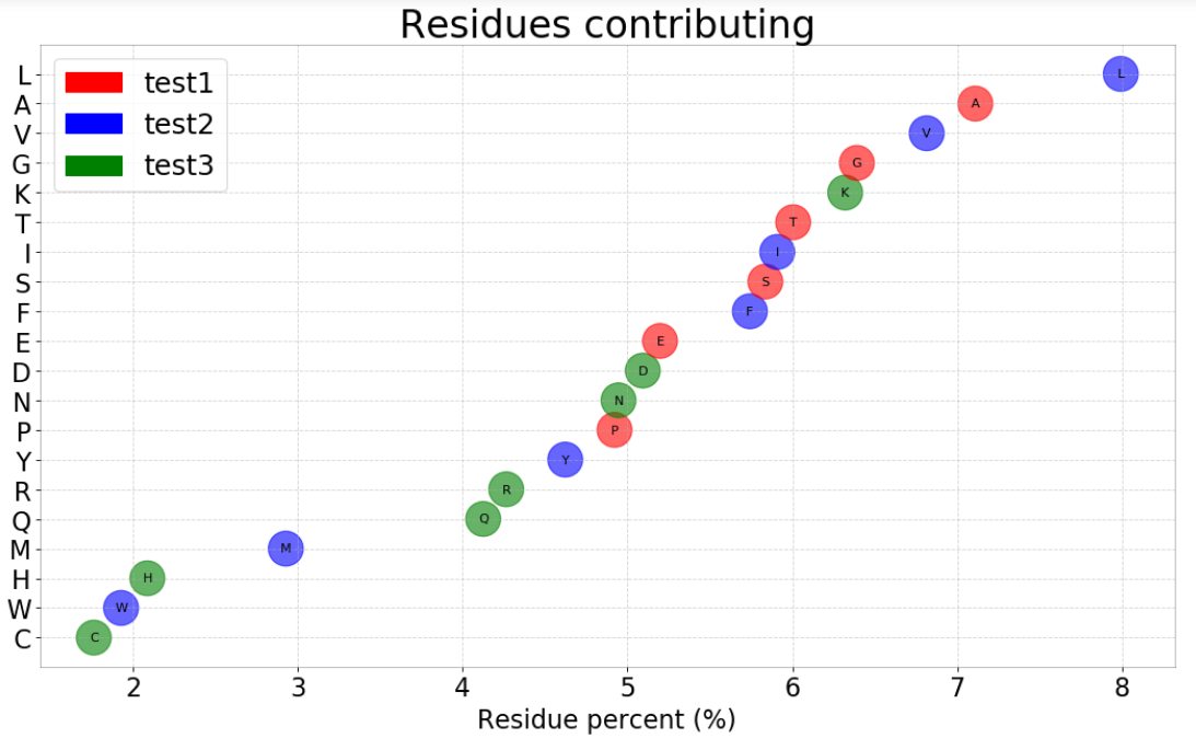
我的案例
import matplotlib.pyplot as plt
import numpy as np
import matplotlib.patches as mpatches

def draw(df_aa,total_aa,ic,seq_number,mode_type):
    df = df_aa # columns: aa,count
    df = df.sort_values('count', ascending=True)
    df['colors'] = ['green'  for x in df['count']]
    df['count'] = df['count']/total_aa *100

    hydrophobic_aa = ['F','I','L','M','V','W','Y']
    xten_aa = ['P','A','S','T','E','G']
    for index_1,row_1 in df.iterrows():
        aa = str(row_1['aa']).strip()
        if aa in hydrophobic_aa:
            df.at[index_1,'colors'] = 'blue'
        elif aa in xten_aa:
            df.at[index_1,'colors'] = 'red'

    df.reset_index(inplace=True)
    df['new'] = df.index

    fig = plt.figure(figsize=(16,9),dpi=80)

    ax = fig.add_subplot(111)
    ax.scatter(df['count'], df['new'], s=750, alpha=.6, color=df.colors)

    for x, y, tex in zip(df['count'], df['new'], df['aa']):
        t = plt.text(x, y, tex, horizontalalignment='center',  verticalalignment='center', fontdict={'color':'black'})

    # Lighten borders
    plt.gca().spines["top"].set_alpha(.3)
    plt.gca().spines["bottom"].set_alpha(.3)
    plt.gca().spines["right"].set_alpha(.3)
    plt.gca().spines["left"].set_alpha(.3)

    plt.yticks(df['new'], df['aa'])

    plt.title('Residues contributing'  , fontdict={'size':30})

    if mode_type ==1:
        plt.xlabel('Residue percent (%)', fontdict={'size':20})
    elif mode_type ==2:
        plt.xlabel('Residue percent (%)', fontdict={'size':20})
    plt.grid(linestyle='--', alpha=0.5)

    ax.tick_params(axis='both', which='major', labelsize=20)
    # plt.xlim(-2.5, 2.5)

    red_patch = mpatches.Patch(color='red', label='test1')
    blue_patch = mpatches.Patch(color='blue', label='test2')
    green_patch = mpatches.Patch(color='green', label='test3')

    plt.legend(handles=[red_patch,blue_patch,green_patch], loc=2,fontsize=22)

    plt.show()

value = 500
mode_type =2
df_aa,total_aa,seq_number = get_experiment_value(value,mode_type)
draw(df_aa,total_aa,value,seq_number,mode_type)
参考资料
药企,独角兽,苏州。团队长期招人,感兴趣的都可以发邮件聊聊:tiehan@sina.cn
![]() 个人公众号,比较懒,很少更新,可以在上面提问题,如果回复不及时,可发邮件给我: tiehan@sina.cn
个人公众号,比较懒,很少更新,可以在上面提问题,如果回复不及时,可发邮件给我: tiehan@sina.cn
