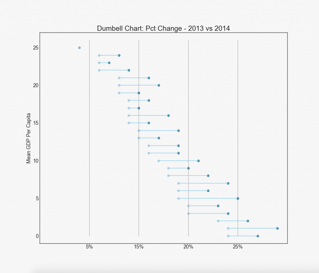
【2.3.5】哑铃图(Dumbbell Plot)
哑铃图传达各种项目的“前”和“后”位置以及项目的排序。 如果您想要将特定项目/计划对不同对象的影响可视化,那么它非常有用。
import matplotlib.lines as mlines

# Import Data
df = pd.read_csv("https://raw.githubusercontent.com/selva86/datasets/master/health.csv")
df.sort_values('pct_2014', inplace=True)
df.reset_index(inplace=True)

# Func to draw line segment
def newline(p1, p2, color='black'):
    ax = plt.gca()
    l = mlines.Line2D([p1[0],p2[0]], [p1[1],p2[1]], color='skyblue')
    ax.add_line(l)
    return l

# Figure and Axes
fig, ax = plt.subplots(1,1,figsize=(14,14), facecolor='#f7f7f7', dpi= 80)

# Vertical Lines
ax.vlines(x=.05, ymin=0, ymax=26, color='black', alpha=1, linewidth=1, linestyles='dotted')
ax.vlines(x=.10, ymin=0, ymax=26, color='black', alpha=1, linewidth=1, linestyles='dotted')
ax.vlines(x=.15, ymin=0, ymax=26, color='black', alpha=1, linewidth=1, linestyles='dotted')
ax.vlines(x=.20, ymin=0, ymax=26, color='black', alpha=1, linewidth=1, linestyles='dotted')

# Points
ax.scatter(y=df['index'], x=df['pct_2013'], s=50, color='#0e668b', alpha=0.7)
ax.scatter(y=df['index'], x=df['pct_2014'], s=50, color='#a3c4dc', alpha=0.7)

# Line Segments
for i, p1, p2 in zip(df['index'], df['pct_2013'], df['pct_2014']):
    newline([p1, i], [p2, i])

# Decoration
ax.set_facecolor('#f7f7f7')
ax.set_title("Dumbell Chart: Pct Change - 2013 vs 2014", fontdict={'size':22})
ax.set(xlim=(0,.25), ylim=(-1, 27), ylabel='Mean GDP Per Capita')
ax.set_xticks([.05, .1, .15, .20])
ax.set_xticklabels(['5%', '15%', '20%', '25%'])
ax.set_xticklabels(['5%', '15%', '20%', '25%'])
plt.show()
参考资料
药企,独角兽,苏州。团队长期招人,感兴趣的都可以发邮件聊聊:tiehan@sina.cn
![]() 个人公众号,比较懒,很少更新,可以在上面提问题,如果回复不及时,可发邮件给我: tiehan@sina.cn
个人公众号,比较懒,很少更新,可以在上面提问题,如果回复不及时,可发邮件给我: tiehan@sina.cn
