【2.4.2】seaborn两变量图(seaborn-jointplot)
jointplot用于两个变量的作图
一、参数说明
seaborn.jointplot(x, y, data=None, kind=’scatter’, stat_func=, color=None, size=6, ratio=5, space=0.2, dropna=True, xlim=None, ylim=None, joint_kws=None, marginal_kws=None, annot_kws=None, **kwargs)
参数说明
x, y : strings or vectors
Data or names of variables in data.
data : DataFrame, optional
DataFrame when x and y are variable names.
kind : { “scatter” | “reg” | “resid” | “kde” | “hex” }, optional
Kind of plot to draw.
**stat_fun**c : callable or None, optional
Function used to calculate a statistic about the relationship and annotate the plot. Should map x and y either to a single value or to a (value, p) tuple. Set to None if you don’t want to annotate the plot.
color : matplotlib color, optional
Color used for the plot elements.
size : numeric, optional
Size of the figure (it will be square).
ratio : numeric, optional
Ratio of joint axes size to marginal axes height.
space : numeric, optional
Space between the joint and marginal axes
dropna : bool, optional
If True, remove observations that are missing from x and y.
{x, y}lim : two-tuples, optional
Axis limits to set before plotting.
{joint, marginal, annot}_kws : dicts, optional
Additional keyword arguments for the plot components.
kwargs : key, value pairings
Additional keyword arguments are passed to the function used to draw the plot on the joint Axes, superseding items in the joint_kws dictionary.
Returns:
grid : JointGrid
JointGrid object with the plot on it.
class seaborn.JointGrid(x, y, data=None, size=6, ratio=5, space=0.2, dropna=True, xlim=None, ylim=None) Parameters:
x, y : strings or vectors
Data or names of variables in data.
data : DataFrame, optional
DataFrame when x and y are variable names.
size : numeric
Size of each side of the figure in inches (it will be square).
ratio : numeric
Ratio of joint axes size to marginal axes height.
space : numeric, optional
Space between the joint and marginal axes
dropna : bool, optional
If True, remove observations that are missing from x and y.
{x, y}lim : two-tuples, optional
Axis limits to set before plotting.
解释:
-
jointplot是画两个变量或者单变量的图像,是对JointGrid类的实现
-
x,y为DataFrame中的列名或者是两组数据,data指向dataframe ,kind是你想要画图的类型
-
stat_func 用于计算统计量关系的函数
-
kind 图形的类型scatter,reg,resid,kde,hex
-
space 定义的是上,右图像距离中间图像的距离
-
color 定义的是图形的整体颜色
-
edgecolor 定义中间图形散点的颜色
-
linewidth 定义图形线条或者散点图的大小
-
marginal_kws 定义边界上hist的参数,以字典的形式传参
二、例子
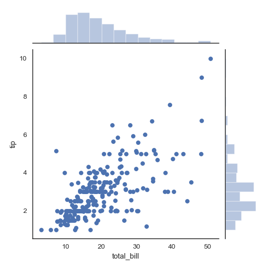
例1:两边带有histogram的散点图
>>> import numpy as np, pandas as pd; np.random.seed(0)
>>> import seaborn as sns; sns.set(style="white", color_codes=True)
>>> tips = sns.load_dataset("tips")
>>> g = sns.jointplot(x="total_bill", y="tip", data=tips)
例2:散点图和histogram中加入拟合曲线
g = sns.jointplot("total_bill", "tip", data=tips, kind="reg")

例3 三点用六边形来代替
g = sns.jointplot("total_bill", "tip", data=tips, kind="hex")

例4 KDE图
>>> iris = sns.load_dataset("iris")
>>> g = sns.jointplot("sepal_width", "petal_length", data=iris,
...                   kind="kde", space=0, color="g")

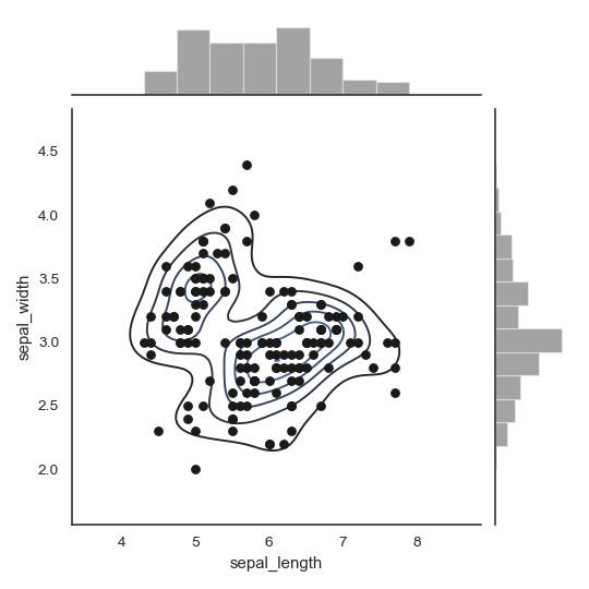
例5 散点图+ KDE图
>>> g = (sns.jointplot("sepal_length", "sepal_width",
...                    data=iris, color="k")
...         .plot_joint(sns.kdeplot, zorder=0, n_levels=6))
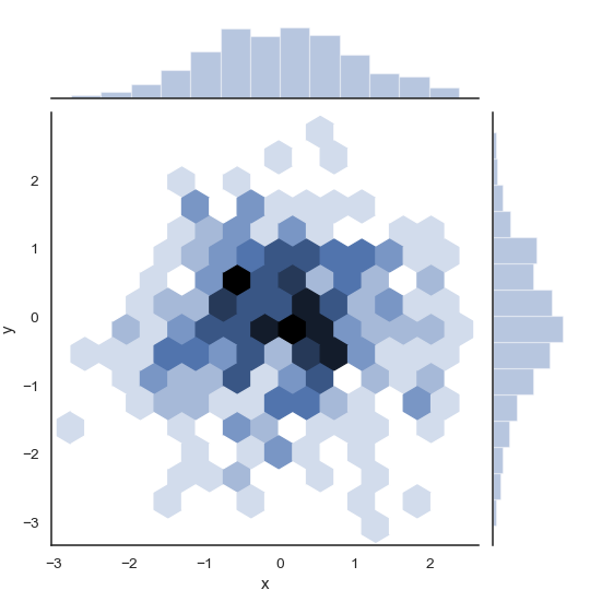
例6 通过向量传递x,y轴
>>> x, y = np.random.randn(2, 300)
>>> g = (sns.jointplot(x, y, kind="hex")
...         .set_axis_labels("x", "y"))
例7 给边框上的图形更多的空间
>>> g = sns.jointplot("total_bill", "tip", data=tips,
...                   height=5, ratio=3, color="g")

例8 添加pearson
import scipy.stats as sci

sns.jointplot(x='v_ma5',y='price_change',data=stock,kind='reg',stat_func=sci.pearsonr,space=0,color='r')
三、我的案例
四、讨论
参考资料
药企,独角兽,苏州。团队长期招人,感兴趣的都可以发邮件聊聊:tiehan@sina.cn
![]() 个人公众号,比较懒,很少更新,可以在上面提问题,如果回复不及时,可发邮件给我: tiehan@sina.cn
个人公众号,比较懒,很少更新,可以在上面提问题,如果回复不及时,可发邮件给我: tiehan@sina.cn
